

Product notes on tools, tests and shipping
The app has a hundred features. Five of them matter.
TL;DR: Teams add options faster than they remove them, and ship without testing the front door. The fix is unglamorous. Draw the user journey before the screen. Cut a hundred features down to the five that carry the usage. Describe the tools clearly enough that a model can build the interface from them. Test with the smallest model available, then test by hand every morning until automation earns the right to replace you.
This post is also available in Deutsch , Español and Italiano .
Draw the journey before the screen
Product work usually starts with a screen. Someone opens a design file, pulls in components, draws a card, adds a toggle, adds three buttons. The result looks polished and helps nobody finish a job.
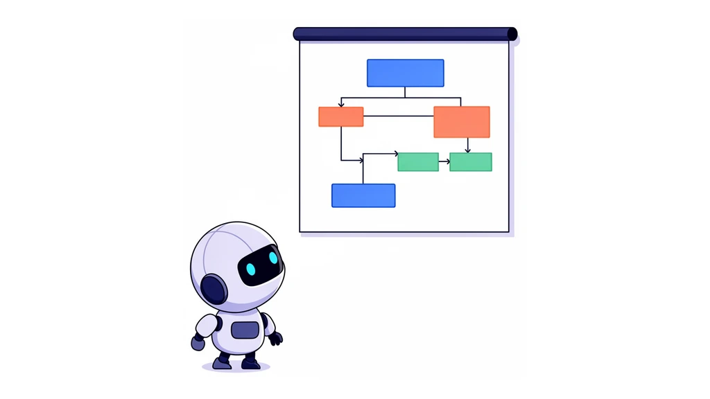
The order is the problem. The first thing you need is a flowchart for the user journey. What comes first? What comes second? What comes third? What depends on what? Which features get used most often? Which features matter most?
Once that drawing is clean, the app can be designed around it. And the tools behind it can be designed around it too. One drawing, two outputs: the interface and the API.
A hundred features, five that matter
A product can have a hundred features, or a hundred things you can configure, and probably only five of them get used 99.9 percent of the time.
Those five have to sit at the front. They have to work every single time. Everything else moves into the background, where it stays reachable without competing for attention.
This is not an argument against features. It is an argument about placement. A capability nobody can find on the first screen is a capability nobody uses.
Reduce the confusion budget
The same lesson shows up twice, once in tool design and once in interface design. Give an agent too many tools and too many capabilities and it gets confused. It hesitates, picks the wrong thing, invents arguments, or loops back to where it started.
A person in front of a screen full of options behaves the same way. More buttons and more settings do not add power. They add chaos.
The answer is not better documentation. It is fewer things. Reduce, reduce, reduce, and focus the whole surface on the job.
Tools, capabilities, particularities
The right shape for a tool server is not a flat list. You have a tool, the tool has capabilities, and the capabilities have capabilities. It fans out backwards, like a tree.
On the first level there are only the tools. On the second level there are the capabilities. On the third level there are the particularities of those capabilities.
That structure is not decoration. It is how a reader, human or model, learns the product without a conversation. A flat list of forty endpoints tells nobody where to start.
A clear description already contains the interface
An MCP server is an API with descriptions of how that API works. When the description is unambiguous, the reader knows the user journey from it.
That opens a door. If a model has the design system on one side and the tool on the other, it can generate the screen in between. The translator in the middle is a language model.
This removes a whole class of meeting. When the description is clear, there is nothing left to argue about. Either the flow can be built from it or it cannot.
The proof is speed, not taste
Design debates usually end in opinion. Whether option A sits above option B is not a question anyone can settle by arguing.
There is a measurable version. How fast does an agent get from A to B through the product? How long does it have to think? Where does it get confused?
That turns interface quality into a number. It also exposes reality: an agent reading a live MCP server will say, plainly, that it does not understand this, and that this is not solved well.
Test with the dumbest model you can find
A frontier model repairs bad naming by guessing from context. It fills in the missing argument, picks the likely tool, and arrives anyway. That makes it a poor judge of whether an interface is clear.
Small low-thinking models with little context do not repair anything. If the naming is slightly off, they fail. If the flow branches unnecessarily, they get lost.
So the small model becomes the instrument. If the dumbest model you can find gets through, the interface is genuinely clear. If it does not, the description is the problem, not the model.
Simplify means remove
The goal is to simplify everything, minimise it, and remove elements. Not add elements. Fewer options, fewer features, less functionality on every screen.
That also rules out one popular move. Rebuilding from scratch is not automatically progress. A rewrite that lands in the same place has cost a quarter and changed nothing.
The wish worth protecting is reduction to what is necessary. Everything else is activity.
One job, one screen, everywhere
Swapping from one currency to another should not have two different screens. It should look 100 percent the same everywhere it appears.
The same in the app, the same in a payment link, the same when someone adds money to a wallet. The payment link is for people outside the product, and that changes nothing. Add money to your wallet and request money by email are the same job.
Every different-looking screen for the same job is another thing the user has to learn. Consistency is not a style preference. It is a cost decision.
Browser agents read the same screen
There are two kinds of agent. One calls an API that was built for it. The other opens a browser and looks at what a person would see.
The second kind is growing, and it needs no special interface. It needs the ordinary one to explain itself immediately.
That is the real test of a layout. If a browser agent on a phone or a desktop cannot work out what the screen is for, a person on the same screen is guessing too.
Test by hand until automation earns it
Automated tests only check what somebody already thought to assert. Until a suite genuinely covers the journeys that matter, a green pipeline is not evidence that the front door opens.
So the rule is manual. Pick the ten journeys that matter, and everyone on the team walks them on a real device in the morning, before email and before the first pull request. Do that until something automatic replaces it.
This is the least fashionable part of the list and the one that catches the most. A login screen that nobody can pass is not an edge case. It is the product.
When nobody on the team opens the product
A broken login is a bug. A broken login that survives for days is an answer to a different question.
If the team does not open the product on a normal morning, the product is not being used by the people closest to it. Every bug then becomes an abstract ticket instead of a personal annoyance.
The blunt version: you throw a party and nobody comes. That feeling is data. It usually means the product was never in the daily routine, and no amount of new features changes that.
A deadline beats a better model
Code generation changed the shape of the junior problem without removing it. A junior engineer with a frontier model and no senior partner does not get faster. They get lost, politely, for days.
The pattern is predictable. A component is requested, a large implementation appears, a build fails, the error goes back into the model, the model proposes a refactor. Ten days later there is still no finished swap.
What is missing is not skill or motivation. It is a deadline, plus somebody to work through the problem with. Code generation without a shipping boundary produces the feeling of work and none of the result.
When one person can build everything
There is a failure mode that only appears when a senior person becomes very fast. In the past, some parts of a system were simply beyond one person. Work had to be handed over completely, and it only moved when the other person delivered.
That dependence created urgency. Remove it and something quiet happens. When everyone knows the fastest person will step in and fix it, nobody stays late on the hard problem. They wait for the complaint and the rewrite.
Being able to do everything yourself is not the same as being effective. At some point the rule has to be that a broken thing stays broken for whoever owns it, long enough for them to feel it. The alternative is a project where one person does the work and the rest watch.
Distribution without an ad budget
Paying for traffic is the expensive way to be ignored. The cheaper route is already sitting in the integration calls.
Before, the successful events were the ones built with ten independent crews, each bringing its own audience. The same move works with infrastructure partners. Record a short call, ask five real questions about the integration, publish the result, and both sides share it.
A technical article written with a partner reaches the partner audience and the builder audience at once. That is 200 new users from one conversation, plus a document that proves the integration works.